
Tuesday, April 28, 2009
3 concepts - developed
Concept 3:
This design differs from the first too as it does not have the ability to lock into itself. It however takes on much more of an aesthetic role with its many folds and successful locking system.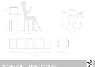 Concept 2:
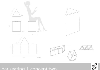
Much like the previous concept, this one also focusing on flexibility of function. This simple form can be arranged either as a single item, wall/bench seating or a large sofa like arrangement.
 concept 1:
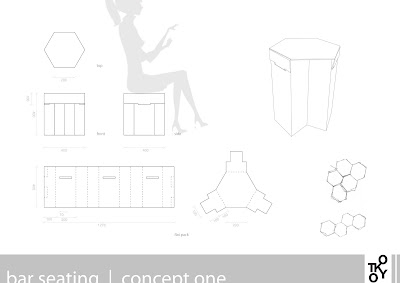
The main focus of this design was to ensure that it had the support of the angled plains and was convient in the way that it could be arranged.
This design differs from the first too as it does not have the ability to lock into itself. It however takes on much more of an aesthetic role with its many folds and successful locking system.
 Concept 2:
Much like the previous concept, this one also focusing on flexibility of function. This simple form can be arranged either as a single item, wall/bench seating or a large sofa like arrangement.
 concept 1:
The main focus of this design was to ensure that it had the support of the angled plains and was convient in the way that it could be arranged.

New brief - Sketches
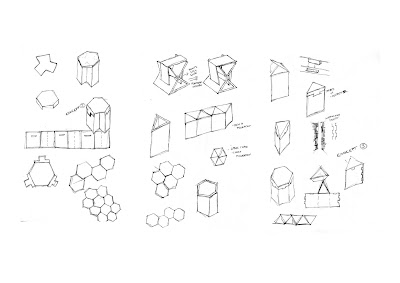
I then continued to sketch similar designs as previously but had more success in developing aesthetics as well as function. I also want to create a design that it easily tranformed into bench, wall or large area seating; therefore being flexible in its use. This wil we done using geometic shapes (such as a triangle or hexagon), that have the ability to sit next to or lock together.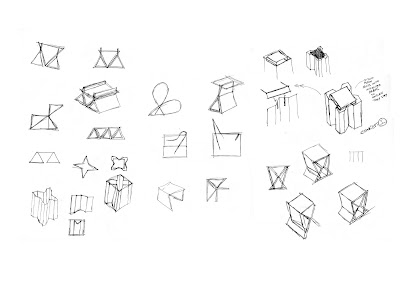


Brief alteration - Bar furniture
New Brief:
After further research on 100% Design Tokyo and observing my previous designs/concepts, I have made a transformation in what i want to achieve through the design of my chair. Due to my current concepts being small and stool-like, the do not succeed in fulfilling my previous brief of seminar seating.
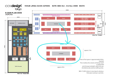
With further research on the existance, location, use and furniture within 100% Bar, I see it as an opportunity to continue the design process I've started already. As you can see from the below image, the bar is situated within the displays and the current furniture is an array of space- consuming tables and chairs. Because people are constantly in an out of the bar between exhibits, it is only logical to have more practically sized furniture.
My design will:
- replace the existing furniture surrounding the bar
- procide a more space concious design through combining the use of table and chair in the one design.
- offer furniture that reflects the concept of a 'quick bite' or drink.
- be easily assembled from a flat pack.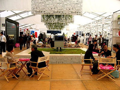 Analysis of the chosen space:
While looking at the locaiton map and the existing furniture within the bar, it is apparent to me that the number of seating could almost be double with the right design.
After further research on 100% Design Tokyo and observing my previous designs/concepts, I have made a transformation in what i want to achieve through the design of my chair. Due to my current concepts being small and stool-like, the do not succeed in fulfilling my previous brief of seminar seating.
With further research on the existance, location, use and furniture within 100% Bar, I see it as an opportunity to continue the design process I've started already. As you can see from the below image, the bar is situated within the displays and the current furniture is an array of space- consuming tables and chairs. Because people are constantly in an out of the bar between exhibits, it is only logical to have more practically sized furniture.
My design will:
- replace the existing furniture surrounding the bar
- procide a more space concious design through combining the use of table and chair in the one design.
- offer furniture that reflects the concept of a 'quick bite' or drink.
- be easily assembled from a flat pack.
 Analysis of the chosen space:
While looking at the locaiton map and the existing furniture within the bar, it is apparent to me that the number of seating could almost be double with the right design.

Tuesday, April 21, 2009
Major Project - Stage 2
Concept four:
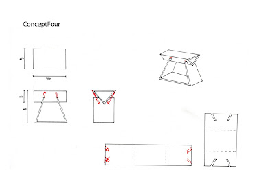
This concept was probably the most successful once revisited. Originally the idea was to have just have the top triangular plain tabbed to the bottom would simply slot in. This however allowed the top half to open with the natural force of the cardboard. So adding the addition tabs to the bottom supporting plains allowed this design to work.
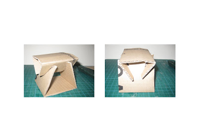
This concept was probably the most successful once revisited. Originally the idea was to have just have the top triangular plain tabbed to the bottom would simply slot in. This however allowed the top half to open with the natural force of the cardboard. So adding the addition tabs to the bottom supporting plains allowed this design to work.


Major Prject - Stage 2
Major Project - Stage 2
Major Project - Stage 2
Concept 1:
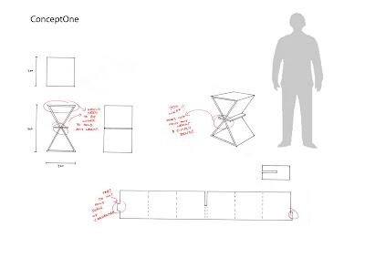
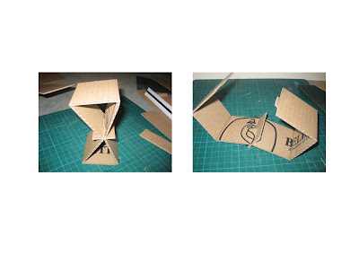
The idea of this concept was to have the pressure from both sides of the triangle to be stong enough. After drawing it up properly and creating a mockup i realised how unsuccessful this design is.
- The tabbing system that holds it together has no reason to hold in place (doesnt work)
- The whole chair is too tall to work, levaing it to bend and crush when weight is applied, therefore a much shorter and wider design would need to be considered.


Major Project - Stage 2
Major Project - Stage 2
Monday, April 20, 2009
Major Project - Stage 2
Bad Design:
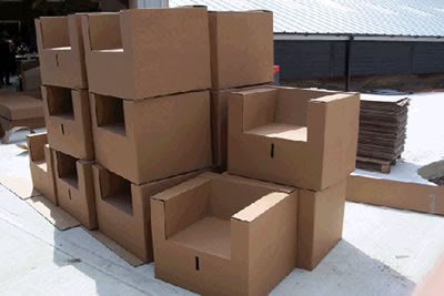
This chair is a solution by Paper Pod Cardboard Creations, a company in the UK that sells these chairs from order. I wanted to post this to demonstrate the exact OPPOSITE of what i am trying to achieve with my design.
 Strengths:
- Design comes in a flat pack and easily assembled/ transported
Weaknesses:
- Not stackable or interlocking in any way
- Very bulky - not space concious
- Does not stear from mainstream design of a chair, therefore not aware of contemporary styles.
This chair is a solution by Paper Pod Cardboard Creations, a company in the UK that sells these chairs from order. I wanted to post this to demonstrate the exact OPPOSITE of what i am trying to achieve with my design.
 Strengths:
- Design comes in a flat pack and easily assembled/ transported
Weaknesses:
- Not stackable or interlocking in any way
- Very bulky - not space concious
- Does not stear from mainstream design of a chair, therefore not aware of contemporary styles.
Major Project - Stage 2
Major Project - Stage 2
Shigeru Ban:
While researching Japanese design I came across Ban's work. He is recognised for his exstensive work with paper and cardboard. All of his creations are functional, thus giving him credit for understanding the mathematics behind his design. Although he only dables in the design of furniture, all of his work pocesses the aesthetics i want to aim for in my final piece; clean cut, beautiful and the appearance of being lightweight.
While researching Japanese design I came across Ban's work. He is recognised for his exstensive work with paper and cardboard. All of his creations are functional, thus giving him credit for understanding the mathematics behind his design. Although he only dables in the design of furniture, all of his work pocesses the aesthetics i want to aim for in my final piece; clean cut, beautiful and the appearance of being lightweight.
Major Project - Stage 2
Major Project - Stage 2
Japanese Inspiraton:
These are some some images that represent the theme I want to encompass in my final design. Much like the work of Sori Yanagi (butterfly chair oon the left), I want my work to be sturdy but look light. I dont necessarily want to work with the curve, but want to achieve a smplistic design that evokes a complex reaction.
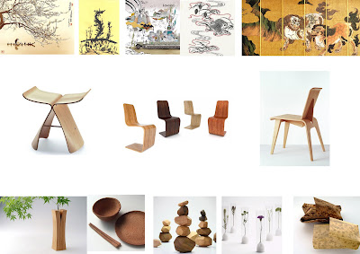
These are some some images that represent the theme I want to encompass in my final design. Much like the work of Sori Yanagi (butterfly chair oon the left), I want my work to be sturdy but look light. I dont necessarily want to work with the curve, but want to achieve a smplistic design that evokes a complex reaction.

Major Project - Stage 2
Event Research:
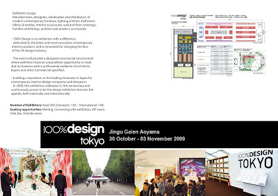
I have chosen to incorperate my design into 100% Design Tokyo. I saw the event as an opportunity to play with the Japanese culture and its venure to be full of potential. Initially when I looked at the plan I was instantly attracted to the seminar room. This would be where exhibitors and visitors from all over the world would come and converse about their designs; a perfect place to provide seating that also celebrates their enthusiasm in contemporary design. Potentially, people within the seminar room will be seated for a lengthy period of time for presentations or awards, so sturdiness of this design is vital.
As it is the 5th anniversary of 100% Design Tokyo, I want to display graphics that reflect this, either in a literal sense or that simply celebrates traditional Japanese art and design.
As for the form of my design, I would like this to also reflect Japanese design by being petite and harmonious. This could possibly be done through symmetry and repitition of form or pattern; this would also (hopefully) fulfil the requirements of being economically viableand practical through using minimal material and the potential to be deconstructed into a flat plan.


Major Project - Stage 2
Cardboard:
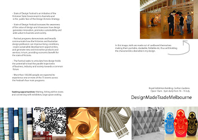
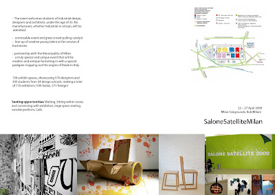
I tried to find some examples of cardboard furniture that we have not yet been exposed to; also tried to explore how such a functional object can be created from minimal effort.
Major Project - Stage 2
Sketching:
These are some sketches i did before strating my research. They are more an exploration of form rather than focusing on the intricate detail of the folds. i seem to be very attracted to the use of a trangular form.
These are some sketches i did before strating my research. They are more an exploration of form rather than focusing on the intricate detail of the folds. i seem to be very attracted to the use of a trangular form.
Tuesday, April 7, 2009
Esquisse 4 | Xanita board box
The task was to create a 60x60x60mm box encorporating 3 traditional xanita board folds aswell as our own locking system. The most challenging part was to ensure the lengths of each side remained the accurate length after the material was folded or cut.
3 Attempts:

Final Solution:
This was my third and final attempt that included the use of a tooth like locking system that slotted into each other. However extremely sturdy when first assembled, this system becomes weaker with every diassembly as the material becomes worn and softened.

3 Attempts:

Final Solution:
This was my third and final attempt that included the use of a tooth like locking system that slotted into each other. However extremely sturdy when first assembled, this system becomes weaker with every diassembly as the material becomes worn and softened.

Esquisse 3.5 | Encorporating Fibonacci
The idea of this continuation of task 3 was to try and encorporate the fibonacci sequence into our forms.
Attempt 1:
With the first attempt looked at the length of a leaf and scored curves not disimilar to those found on a fibonacci spiral.
 Attempt 2:
With the second attempt i made a leaf consisting of several petal like components arranged in the sequence of fibonacci.

Attempt 1:
With the first attempt looked at the length of a leaf and scored curves not disimilar to those found on a fibonacci spiral.
 Attempt 2:
With the second attempt i made a leaf consisting of several petal like components arranged in the sequence of fibonacci.

Subscribe to:
Comments (Atom)


